If you’re taking your first steps into the world of stock markets and possibly thinking of investing, you are probably spending quite some time surfing the web and googling for everything you can on the subject. Depending exactly on what you are looking for, the topic might be vast and complex. Moreover, some very bright academics like to explain concepts to the essence and specially in what relates to risk, stock markets, securities, derivatives, etc. it is common to find very well written papers which contain great mathematical formulas.
The problem is, sometimes people are just looking for a simple how-to or generic information on the topic. This is when infographics are a great resource as they will give us a quick understanding using visual elements.
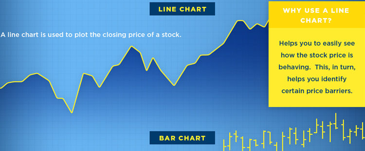
The following infographic from StocksToTrade depicts the three most common types of stock charts used, and the information typically contained in them.

What is a stock chart?
It’s simply a price chart that shows a stock’s price plotted over a time frame, and it shows a few key sets of information:
1. Stock symbol and exchange
The symbol for the stock, as well as the specific exchange it trades on.2. Chart period
Typically daily, weekly, monthly, quarterly, or annually. Traders usually concentrate on daily and intraday data to forecast short-term price movements. Investors usually concentrate on weekly and monthly charts to spot long-term price trends.3. Price Change
There are four key data points from a day’s trading: open, high, low, and close. “Open” is the price at the start of the day and “close” is the price at the end of the day. The “high” is the highest price during the session, while the “low” is the lowest.4. Last Change
Displays the net change, positive or negative, from a previous price. On a daily chart, it would be from the previous day’s close.5. Types of Charts
There are three basic types of charts used:
- Line: Plots the closing price of a chart over time, helping you to see how a price is behaving.
- Bar chart: Plots the open, high, low, and close (OHLC) for each day using bars.
- Candle and stick chart: A visually appealing chart similar to a bar chart that shows OHLC data in an easy way.
6. Volume
Volume is the amount of stock that has been bought and sold within a specific period of time. If a stock moves on low volume, it means that few people are participating in the current price movement and the trend may not continue. Meanwhile, if a stock moves on high volume, it means many people are involved in the trade and the trend is more likely to continue.
What kind of Infographics would you like to see in our blog? Please submit your comment below.


