A Markov process is one where the past bears no relevance on its future evolution.
Our real world is clearly not Markov! History shapes the future. In particular, market future prices are not influenced by today’s events alone. Past market behavior is a key shaper of future events, perhaps because traders themselves believe so. When traders collectively apply charting techniques to determine support and resistance levels and base their trading decisions upon these levels, they effectively introduce a self-fulfilling prophecy: The next market level is to some degree shaped by the traders’ predictions and therefore by the underpinnings of these predictions, i.e. the historical market data.
While you can easily peruse tables of market prices that go back to World War II, chances are that you want to perform a few calculations with them. Since most of you use Excel for performing various calculations, it would be convenient if you could somehow bring the desired data into the spreadsheet.
The acquisition and display of historical data is accomplished with the help of two Deriscope formulas.
The first formula creates an object that contains the specification details of the desired data, such as the associated ticker, time interval, type of reported fields, but also meta-processing instructions like ordering, filtering, scaling etc.
The second formula does the “dirty” job: It sends the request for the desired data to the provider’s server, receives the response and displays it on the spreadsheet.
Rather than typing these two formulas by hand, it is much easier to let the wizard do it for you. For example, in order to get historical data from Yahoo Finance, you must click on the Tools button, select the Insert Function item, followed by the Live Feeds item, then the (Yahoo Finance) item and finally click on Time Series.
The following video shows these steps:
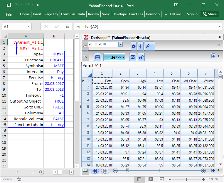
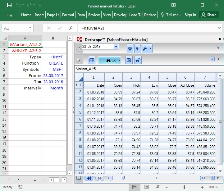
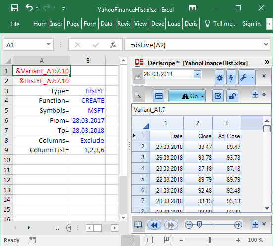
The formula =dsLive(A2) in cell A1 is the one that does the “dirty” job mentioned above. It contacts the Yahoo Finance server, receives the data and returns the text &Variant_A1:1.1, which is the handle name of the received data held in Excel’s memory. The contents of this collection are displayed inside the Browse Area of the wizard as soon as cell A1 is selected.
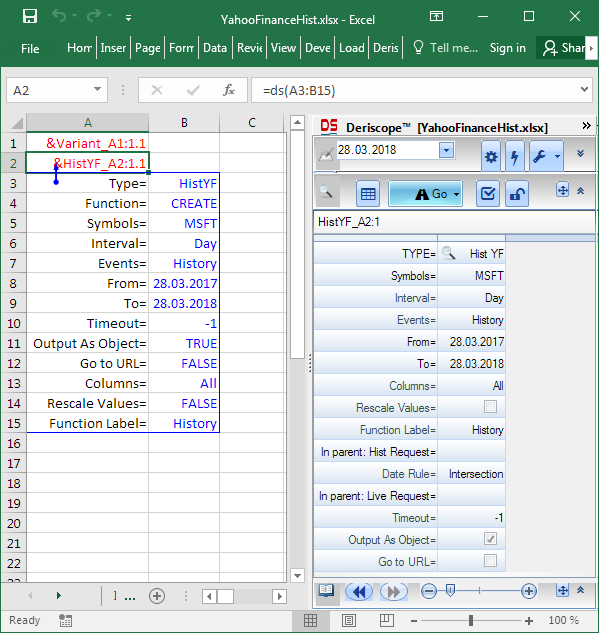
Cell A2 contains the formula =ds (A3:B15), which defines the details of the request. It returns the text &HistYF_A2:1.1, which is the handle name of an object of type Hist YF. As with cell A1, the contents of this object are also displayed by the wizard as soon as cell A2 is selected. The next image demonstrates this fact:
Output as Array versus Output as Object
Even though the data are held inside an object, you can easily bring all or a portion of the data shown in the wizard to the spreadsheet as shown in the video below:
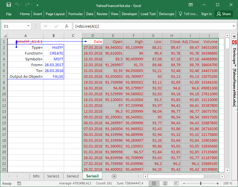
Alternatively, you can instruct the formula in cell A1 to return the received data directly to the spreadsheet instead of keeping them in memory by setting Output As Object= FALSE.
This is shown below, where all optional input parameters have been removed for simplicity:
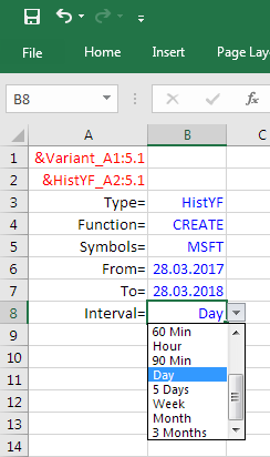
Selecting the Sampling Interval
The sampling interval can be set by clicking the validation dropdown on the cell next to the Interval key as shown below:
Setting it to Month, the result looks like:
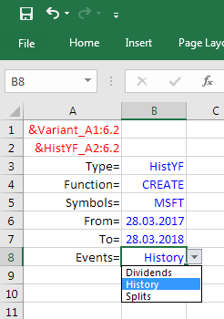
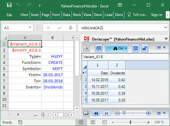
Selecting History, Dividends or Splits
The Events key controls the kind of data requested from the server.
There exist three valid options as shown below:
Setting it to Dividends, you get the following result:
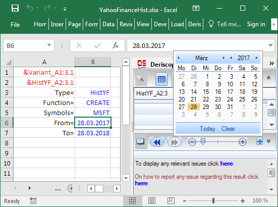
Selecting the Time Range
The time range spanned by the historical data is controlled by the keys From and To. Deriscope helps you change the respective dates by offering you a popup calendar as soon as you select any date-containing cell:
Selecting which Columns are Displayed
You can display only a subset of the original columns by changing the value of the Columns property. When you select the value cell, the following validation drop-down appears:
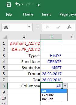
If you set it to Exclude, the function returns an error, due to missing input. The wizard will helpfully instruct you to add the additional Column List property, the purpose of which is to specify the indices of the excluded columns.
You see below how the Open, High, Low and Volume columns are excluded after you enter the text 1,2,3,6:
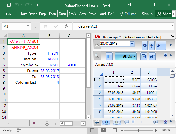
Many Symbols
You can process more than one symbols by associating an array of cells with the Symbols key.
Then the Columns property will not be required as input because it will be set by default to Include. The Column List property can be used to specify which columns are displayed. For example, setting Column List to 4 results in the display of the Close column alone:
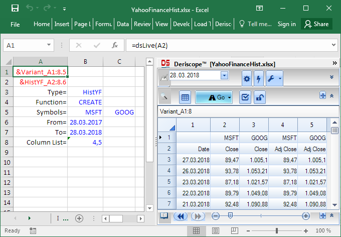
Setting Column List to 4,5 results in the display of the Close and Adj Close columns:
Comparing the Time Series of Different Symbols by Re-scaling them
When you display historical data on several symbols side-by-side, you may be interested in comparing the price series in a meaningful sense by rescaling the values so that they all start with the same number, typically 100.
Imagine you want to compare the MSFT and GOOG prices. Since the MSFT price varies around 100 and the GOOG price around 1,000, any direct comparison becomes meaningless. Even displaying both price curves on the same chart would be tricky, since the MSFT curve’s variations would be hardly visible in a chart designed to display values from 0 to 1000.
The solution is served by the Rescale Values property, which transforms all numbers so that they start with the common base of 100. It is actually possible to set a custom value for both the common base and the date when it applies.
Below you see the result, where the Interval has been set to 3 Months so that all output data can be easily seen inside the wizard:

Now the price evolutions of the two stocks are directly comparable to each other. For example, one readily concludes that Microsoft has grown faster than Google in the indicated time interval since both stocks started at the same price of 100 at the start of that interval.


