In the previous article (part 1), I’ve introduced the concept and possible applicability of a risk heat map, when capturing and managing operational risk. This article explains how to achieve the two heat maps described in part 1, including the data setup and necessary adjustments in Excel in order to plot all the risks (roughly 100) into an ineligible chart.
The idea is that you can reuse the example heat map table, populate it and score your relevant risks and be able to see the result in the heat map chart.
Step 1 – Risk Data Setup
The first step is to create a spreadsheet to record the relevant risks. The sheet I use has the following column headings:
- Risk ID: unique for each risk
- Dept Ref: short reference to distinguish each department
- Risk Type: description of the risk type e.g. an applicable generic risk
- Business Unit: this may or not be the department name (in this example it is assumed so)
- Risk Description: self explanatory, this the goal is to record the risk description
- Probability: ranges from 10 to 40. See the risk ratings table below
- Impact: ranges from 10 to 40. See the risk ratings table below
- Risk Score: corresponds to the product of probability rating scores and the impact rating scores
- Concat: used for the charts, it’s simply a concatenation of the “Probability” with “Impact” columns
- RiskID: used for the charts, same as “Risk ID” but without the leading “R” i.e. “R1” becomes “1”
- Probability (%): used for the charts, macthes the value in column probability with a corresponding % which is in sheet “Risk Ratings”, using a vlookup function
Once you are done setting up the necessary columns, make sure you save the file as a macro – File > Save As > Save as Type “Excel Macro-Enabled Workbook (*.xlsm).
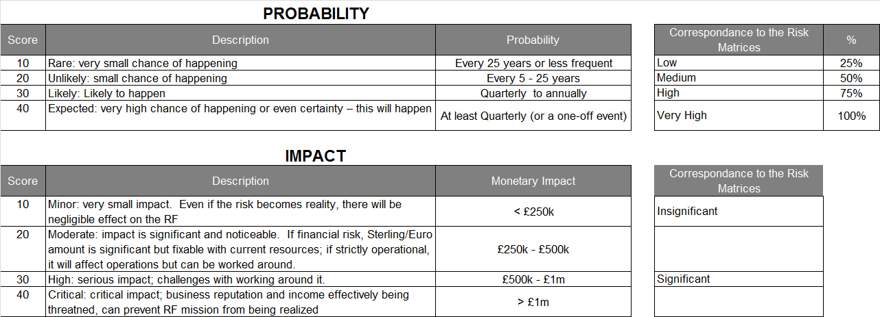
Step 2 – Understanding Sheet “Risk Ratings”
Sheet “Risk Ratings” contains the different scores, descriptions and criterias used for the “Probability” and “Impact” dimensions. Note that in this example sheet, I am using a 4 score rating system (10, 20, 30, 40), which correspond in the risk matrices to “Low, Medium, High, Very High”. Some firms use a 5 score rating system, for example Low, Medium, Medium-High, High, Very High.
Step 3 – Fill in sheet “Risk Assessment Data”
The next step is to fill in your risk assessment data. The spreadsheet is pre-filled with dummy example data that you should replace with your own. My advice is that you replace (overwrite) the existing risk data instead of deleting all entries and creating new ones – this is the best option to make sure the heat map displays correctly. Also note that the dummy risk entries have different impact and probability scores. This will induce some level of risk dispersion in the risk heat map which is useful to understand the example.
Step 4 – Understanding sheet “Heatmap Table”
The heat map table below displays the same risk data only a more summarised way, yet also allowing a graphical representation of risks in a RAG scale. The heat map table was created following two distinct steps:
- Populate the table: using function countif(), the table is filled crossing all possible combinations of row versus column (e.g. 10×10) which origin in the “Risk Assessment Data” sheet
- Applying colour scales to the heat map: using Excel native function “Conditional Formatting > Color Scales“. The standard function will apply predetermined colours but you can adapt and use your custom colours
Step 5 – Update Chart Data and Labels
After filling in your risk assessment data as explained in step 3, go to sheet “Risk Factor Graph” and click on button “Update chart data and labels“. If everything is correctly input in sheet “Risk Assessment Data”, your heat map should plot correctly and display your risks in your Red, Amber and Green (RAG) chart.
Conclusion
Even though Excel includes several pre-made charts, when you have a considerable amount of data (e.g. 100 risks) to plot in a chart, you might face difficulties and issues displaying them. Part 1 of this article and Part 2 in this article explain how to achieve a simple yet populated risk heat map using Excel.
Please comment below, we look forward to get your feedback on this solution and if you were able to apply it to your real life challenges.
If you liked this article, please donate below and contribute for this blog to continue alive. Thank you in advance!
Download this Example Risk Heat Map
Click here to download the Excel spreadsheet (zip format). Note: you must enable macros in Excel in order to run this file.