Risk heatmaps are a common tool for many risk managers. A risk map is built by plotting the frequency of a risk on one axis of the chart and the severity on the other. Frequency is how likely the risk is or how often you think it will occur, while severity is how much of […]
RAG
How to Create a Risk Heatmap in Excel – Part 2
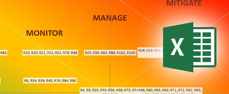
In the previous article (part 1), I’ve introduced the concept and possible applicability of a risk heat map, when capturing and managing operational risk. This article explains how to achieve the two heat maps described in part 1, including the data setup and necessary adjustments in Excel in order to plot all the risks (roughly 100) into an ineligible chart. […]
How to Create a Risk Heatmap in Excel – Part 1
Risk heat maps are commonly used in operational risk management and are specially useful to represent a firm’s risks in a visual manner, highlighting the ones that need to be managed more closely. When assessing operational risk, the risk manager will typically use a spreadsheet to record its firm’s key risks and rate the impact and likelihood (or probability) assessment scores for […]


